How To Solve IELTS Pie Chart Questions


Table of Contents
- Overview
- What is the IELTS Pie Chart?
- How to Write a Pie Chart Essay?
- Tips to Solve IELTS Pie Chart Questions
- #1. Read the Question Properly to Select the Information
- #2. Identify the Main Features
- #3. Follow The Right Structure
- #4. Meet The Requirements of The Task
- #5. Focus on Your Vocabulary
- Some More Tips to Solve IELTS Pie Chart Questions
- Pie Charts Sample Questions & Answers
- Sample Answer
- Sample Question 2
- Sample Answer
- IELTS Pie chart Sample Question 3
- Sample Answer
- IELTS PIe chart Question Type : Assessment
- Practice Question 1
- Practice Question 2
- Practice Question 3
- Another Pie Chart Questions and Answers
- Another Pie Chart Question
- IELTS Pie Chart FAQs :
- Conclusion :
Quick Answer: How do you answer an IELTS pie chart question?
IELTS pie charts appear in Academic Writing Task 1, where you write a short descriptive essay (at least 150 words in about 20 minutes) summarising the data. Use a four-part structure: an introduction that paraphrases the question, an overview of the main trends, body paragraphs with specific figures, and a brief conclusion. Report the biggest and smallest slices and notable changes — don’t list every number.
- Academic Writing Task 1: ≥150 words in ~20 minutes
- Structure: introduction → overview → body (with data) → conclusion
- Vocabulary/lexical resource is worth 25% of your Writing score
A Complete Guide To
IELTS Pie Charts
Chapter 1
Overview
In Academic Writing Task 1 of IELTS, you are asked to create a short descriptive essay based on visual data and information. Pie charts can be one form of such visual data. Read on to get an in-depth understanding of the IELTS Pie Chart Essay.
What is the IELTS Pie Chart?
A pie chart is a circular chart that is divided into sections or ‘pie slices’, which are commonly used to depict percentages. The size of each pie slice signifies the relative amount of data it represents. The slices form a complete circle when joined together. Pie charts are often used in business and the media but less so in scientific or technical writings.
Chapter 2
How to Write a Pie Chart Essay?
Pie charts come in a variety of forms, including those with and without percentages or numbers. To write a pie chart essay, follow the following structure:
Introduction
The first section of your IELTS pie chart response is an introduction to the chart written in one or two sentences. Here, you must paraphrase the data given in the topic, i.e. the line in the question that describes what is shown in the pie chart.
Overview
The second section is a basic outline in which you must discuss the essential aspects of the pie chart in general terms. The objective is to give an overarching picture of what is depicted.
Body Paragraphs
This section deals with precise details from the pie chart, which you should select and put together in a couple of paragraphs. Avoid mechanically presenting the information. Instead, ensure that there is a rationale behind what you pick and how you present it.
Conclusion
The conclusion must sum up the ideas discussed in the earlier paragraphs without being repetitive. It would be a good idea not to introduce totally new ideas here and yet provide a unique point related to what was said before.
Tips to Solve IELTS Pie Chart Questions
#1. Read the Question Properly to Select the Information
Before you start, read the provided information to get a basic understanding of what is shown in the pie chart. Match that with the title of the pie chart and the items that are portrayed. Read each word of the question carefully to understand what you are expected to do. Then the rest of the task becomes easy.
#2. Identify the Main Features
Pie charts are used to display percentages or proportions. Aside from that, they are fundamentally the same as bar graphs and line charts in that they constitute a visual representation of data. The image in the IELTS pie chart topics is generally easy to understand. Remember that each question is designed to assess your linguistic skills rather than your mathematical competence. So you should be focusing on appropriately selecting information, organizing it effectively, and presenting the same using good written language.
Search for the highlights. These are generally the easiest to identify. The image will have a wealth of information to assist you in identifying them.
Here are some questions to ask:
- What are the measurement units?
- What are the time periods?
- What can you learn from the title?
- Are there any similarities?
- What are the largest and smallest values depicted?
- Are there any contrasts that you can highlight?
#3. Follow The Right Structure
- A pie chart essay structure contains these key elements:
- Introduction
- An overview of the pie chart followed by the body paragraphs, and
- A conclusion
- You can play with the structure as long as your organization of points and the key elements mentioned above is logical and cohesive.
- Connecting words are used to make the content inside sentences and paragraphs more cohesive. Instead of presenting a set of distinct sentences and ideas, link them together using connecting words to ensure flow.
#4. Meet The Requirements of The Task
- Ensure that you have met the word count. It is okay to exceed the word count provided you are able to manage the time and maintain consistency throughout your essay. (Take care that you do not waste too much time on Writing Task 1, thus losing out on the time for Writing Task 2, which contributes much more to your Writing score.) In any case, do make sure you don’t write less because the objective here is to evaluate your writing skills.
- Provide an adequate description of the entire graph without omitting any major points.
- Concentrate on the task and the pie chart, without going into digressions or any assumptions of your own that cannot be directly supported by what is given. Even if a point seems objectively true in a general sense, do not include it if it cannot be inferred from the information and the pie chart provided.
#5. Focus on Your Vocabulary
Vocabulary is critical to attaining a high score in writing tasks. Scoring well on vocabulary within the constraints of the instructions might seem a bit difficult. But if you follow these pointers, you are good to go.
Maintain the following to demonstrate that your essay has a strong vocabulary for IELTS:
- Make use of a wide vocabulary range, but avoid words that you are unsure of. These will stand out in your writing and cause you to lose marks.
- Avoid using phrases and words that are repeated. Think of other words or phrases that you can use instead.
- Try to include phrases and idioms you know in your response, as long as they fit into the context.
- Use precise language. Don’t be vague or overly wordy.
- Make use of synonyms.
- Choose and use effective connectors/transition words and phrases. These might seem to be pretty common words and phrases; however, using the right connecting word in the right place and using a varied range of such words will showcase your vocabulary in a good light.
Enriching your vocabulary can help you achieve a high band score because it accounts for 25% of the total score!
Some More Tips to Solve IELTS Pie Chart Questions
Follow the tips given below to tackle the pie chart questions in IELTS Academic Writing Task 1:
- Read the question and the pie chart(s), and determine what is important.
- Concentrate on incorporating relevant facts from the pie chart(s) into your essay.
- Pay attention to the time frame of your question and use a suitable tense.
- Paraphrase the given information to avoid using the same words as the question in your introduction.
- To ensure continuity and flow, use transition words.
- Avoid repetition of ideas and vocabulary as much as possible.
- Do not be alarmed if the information on your pie chart differs from other given information. In such circumstances, including a summary of each image.
- Personal opinions should be avoided at all costs.
Now, let’s implement these tips to solve the IELTS Pie Chart Essay sample questions given in the following section.
Pie Charts Sample Questions & Answers
You should spend about 20 minutes on this task.
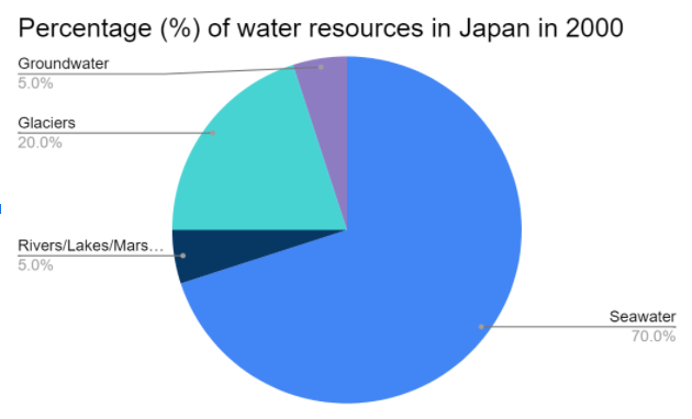
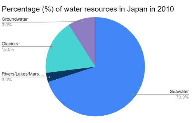
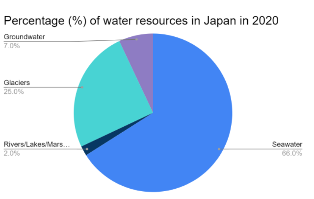
The charts below show the percentage of available water resources in Japan in 2000, 2010, and 2020. The table shows the percentage of annual water consumption in the country in those three years.
Summarise the information by selecting and reporting the main features, and make comparisons where relevant.
Write at least 150 words.
|
2000 |
65 |
|
2010 |
77 |
|
2020 |
93 |
Sample Answer
Sample Answer
The pie charts illustrate the percentage of water resources in Japan in the years 2000, 2010, and 2020, while the table shows the annual water consumption in the country in those years.
At a glance, specific changes can be easily detected. Seawater, the largest water resource in Japan, remained constant across the two decades until 2020 when we can see a decrease in the amount by 4%. There has been a steady decline in the amount of freshwater from rivers, lakes, and marshes. The water from glaciers, on the other hand, seems to have increased since 2000, after a slight dip in 2010. Groundwater has also increased from its initial value, though it fell again from 9% in 2010 to 7% in 2020.
With regard to the table, the annual water consumption has been increasing steadily since 2000, with 2020 seeing the highest amount of 93 gallons. Regardless of the cause, this is a concerning statistic, considering that the amount of freshwater resources available in the country has not increased significantly.
Sample Question 2
You should spend about 20 minutes on this task.
The pie charts below show the online shopping sales for retail sectors in New Zealand in 2003 and 2013.
Summarise the information by selecting and reporting the main features, and make comparisons where relevant.
Write at least 150 words.
Sample Answer
The two pie charts compare the percentages of online sales across four different retail sectors in New Zealand in the years 2003 and 2013. For three of these sectors, it is evident that over this time frame, there was a significant change in their proportion of online transactions.
At 36%, we can see that the travel sector accounted for the majority of online sales in 2003, but this percentage dropped to 29% by 2013. Across the same ten-year period, we can see that film/music transactions went from just 21% to 33%, making it the retail sector with the highest overall share of sales on the online market. In 2003, the clothing industry boasted an impressive 24% of total online sales in New Zealand. However, by 2013, the figure fell considerably to 16%.
Interestingly, online sales of books eventually overtook sales of clothes, although books still represented only 22% of the market. Books are the retail sector with the least change in the percentage of sales.
IELTS Pie chart Sample Question 3
Question 2
You should spend about 20 minutes on this task.
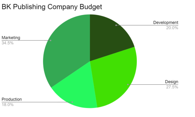
The charts below show the yearly budget of two publishing companies—BK and Nook.
Summarise the information by analyzing and reporting the main features, making comparisons where relevant.
Write at least 150 words.
Sample Answer
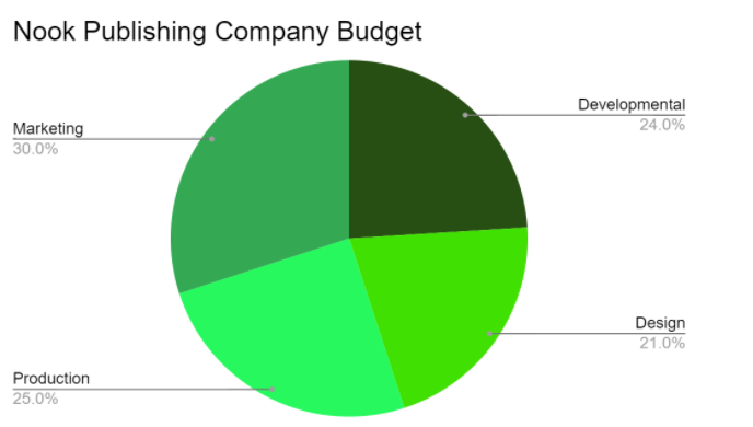
The given pie charts portray the yearly budget of two publishing companies—BK Publishing Company and Nook Publishing Company. The budget for both companies is allocated to four sectors, namely Development, Design, Production, and Marketing.
In both companies, marketing seems to have the largest budget, with BK allotting 34.5% to the sector and Nook assigning 30%. This speaks for the weight of marketing in the industry. With respect to Development, the two companies differ by a slight percentage, with BK dedicating 20% and Nook 24%. But BK clearly values its Design sector as it has the second-highest budget in the company, with 27.5% for its tasks. Nook, however, has only set aside 21% for its Design projects. On the other hand, the budget of Nook’s Production sector is significantly higher than BK’s, with the former allocating 25% and the latter only 18%.
Overall, while there are quite a few differences in the budget dedicated to each sector in both companies, there aren’t any drastic divergences, showing that each of the four sectors plays an invaluable role in both places.
IELTS PIe chart Question Type : Assessment
Practice Question 1
You should spend about 20 minutes on this task.
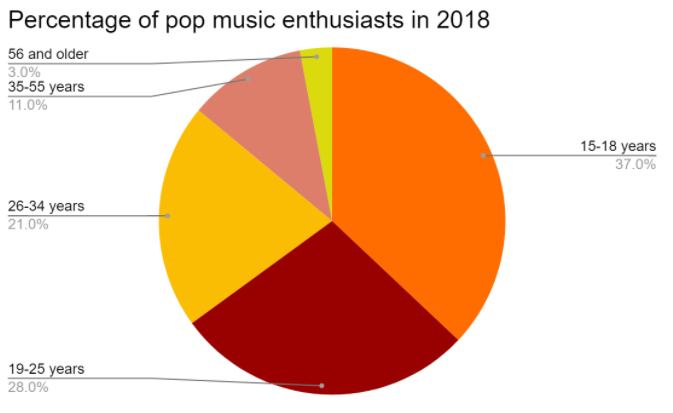
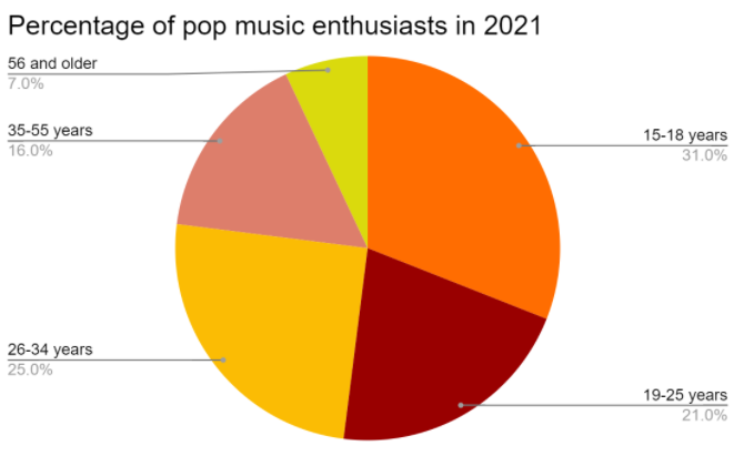
The pie charts below show the percentage of pop music enthusiasts according to age in 2018 and 2021.
Summarise the data by selecting and reporting the main features, and making comparisons where relevant.
Write at least 150 words.
Practice Question 2
You should spend about 20 minutes on this task.
The pie chart shows the career preferences of the 2010-batch students from St. Albert School. The table shows the percentage of 2010-batch students from St. Albert School employed in various sectors in 2018.
Summarise the information by selecting and reporting the main features, and make comparisons where relevant.
Write at least 150 words.
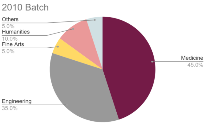
|
Employed Sector (2018) |
Percentage of Students (%) |
|
Medicine |
31 |
|
Engineering |
20 |
|
Fine Arts |
10 |
|
Humanities |
25 |
|
Others |
14 |
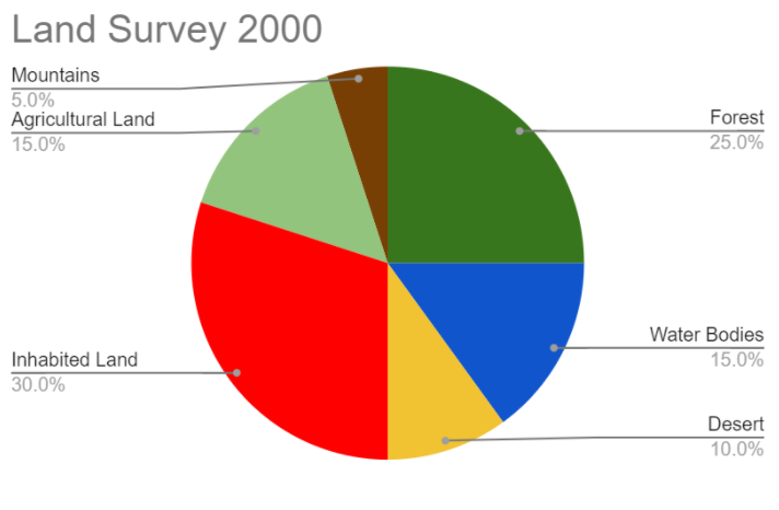
Practice Question 3
You should spend about 20 minutes on this task.
The pie charts represent data from land surveys conducted in India in the years 2000 and 2020.
Summarise the data by selecting and reporting the main features, making comparisons where relevant.
Write at least 150 words.
Another Pie Chart Questions and Answers
The pie charts below show the devices people in the 18 to 25 age group used to watch television in Canada in two different years.
Summarize the data by selecting and reporting the essential elements, as well as making appropriate comparisons.
Write at least 150 words.
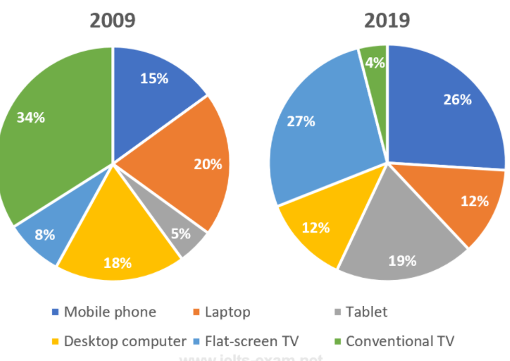
The two graphs show which devices young adults in Canada used to watch television in 2009 and how this changed in 2019. One of the most significant shifts is the shift from traditional televisions to flat-screens, with the former declining from 34% to 4% and the latter jumping from 8% to 27% during the same time period. The latter surpassed the former as the most widely used TV viewing device in 2019.
Another general tendency is that, compared to 2009, young folks in 2019 preferred watching tv on smaller, handheld devices. In particular, the usage of mobile phones for watching television almost doubled, going from 15 to 26%, with tablet use increasing nearly fourfold to 19 percent from 5%. This tendency is in alignment with the change in the number of 18 to 25-year-olds who watch TV on laptops. The use of both desktop and laptop computers decreased significantly, each category losing nearly one-third of its users.
Overall, the two pie charts indicate that TV viewing preferences in Canada have shifted away from older gadgets and toward more recent equivalents over the period from 2009 to 2019.
Another Pie Chart Question
The graph shows data on the manufacture of passenger cars in 2015.
Summarize the data by selecting and reporting the essential elements, as well as making appropriate comparisons.
IELTS Pie Chart FAQs :
How many words do we need to write for an IELTS Pie Chart Essay?
You must write at least 150 words, preferably more. The recommended word count is 160 to 180 words.
What are the essential elements of a Pie Chart Essay?
The essential elements of a Pie Chart Essay are an introduction, overview, and conclusion.
Where should the essential aspects of the pie chart be highlighted?
The essential elements of the pie chart should be covered in the overview and described in detail in the body of your essay.
Conclusion :
The Pie Chart Essay is one of the most common question types in IELTS Academic Writing Task 1. You must write a response explaining the given pie chart.
You must be capable of preparing a report of at least 150 words in 20 minutes. To get a band 8 or higher, you must thoroughly investigate the question and identify crucial features that can be written down.
We hope you found this article on IELTS Pie Charts informative. Stay tuned for more!
Want to know where you stand? Take a free full-length IELTS mock test to get an instant band-score estimate before exam day.
Estimate your overall band with our ielts band score calculator.
Ready to practise under real exam conditions? Take a free IELTS mock test.
Build confidence before the real exam by taking our IELTS practice test.